Making maps is hard. Even though we’ve been making maps for hundreds of years, it is still hard. Making good looking maps is really hard. We published a map that is both beautiful and tells a story, and this is the story of how we made that map.
But a figure like this does not appear immediately, it takes work to get something to look this good, and needless to say it wasn’t me that made it look so great!
The genesis of this figure was our global survey of crAssphage, a virus that is present in ~50% of the people in the world, and for which we assembled an international team of collaborators who collected samples from about 2/3 of the countries on the planet. This is an unprecedented look at the distribution of a single virus around the wold. Of course, in 2020 it has been superseded by a different type of virus, but COVID-19 was unknown when we did this work!
We started with metadata tables that include the latitude and longitude of every sample that our collaborators collected (that table is one of three: one for each of the samples of DNA that we sequenced). We also generated a distance matrix, called a cophenetic matrix, that tells us the similarity between any sample and any other.
The basic data that we want to visualize are:
- How many samples were collected at each site?
- Is the most similar sequence at the same site or else where?
- Is there any relationship between sites?
We were inspired by typical airline flight maps and the spread of human genetic variation to make a similar map of the spread of crAssphage around the world (see what I mean about it being hard to make a good looking map?)
When building a map image, the first thing you need to consider is how you are going to plot the data. There are lots of options, but I quickly settled on the awesome cartopy library (developed in part by the MetOffice) that connects with Python. Next, you need to think about is your map’s projection. Obviously, I have a thing with Robinson (that is the only projection you’ll see here), and you can intuit what that means about me. However, more recently I’ve been enjoying the Cahill-Keyes projection (more about that later).
You can see explore the code that we used to draw the maps in our GitHub repo, and this is the directory with the data and how to draw the raw maps.
Armed with this, I created this hideous world map:

In that map, the dots have different colour grey scales (they do, they do) that indicate how many samples were collected at each site. The red lines show the connections between sites – the thicker the red line the stronger the connections. The somewhat elliptical circles (because the globe is, well, a globe, you can’t project a circle on it) demonstrate places where the sequences are most similar to each other.
This figure is missing a lot of information, notably a legend, and how the red lines vary with number, so lets add a legend and change the red lines from just red to red and green. That is bound to make things better, right?

This is an overwhelming cacophony of colour, and there is no way that this figure is meaningful or would reproduce well in a journal.
At this point, you can either throw more data at the image, or you can find an artist and get some serious colour help. Fortunately for the generations of cartographers who preceded me, I opted for the latter, and called the brilliant artist and science visualization heroine Kim Reasor. Here is some of her amazing urban art, and Kim presented “Embers of Life: A Science-Art Journey to the Finnish Arctic” that combines art and science to explore microbial members of the snow (yes, Kim understands microbiology, useful for this project!). Most recently, Kim is the 2020 Climate Art Fellow.
So I shared my maps (yes, those ones above) with Kim, and sought some help and advice.
Her first response was not exactly what I expected! She printed my lovely (?) figure out, turned it over, pulled out the crayons and re-visualized it like this:

The point she was trying to make (or at least the point I took away from it) was that you can’t display 60+ gradations of colour on a map.
Lesson 1: Stick to four or five colours in your figure!
If you look back at the previous plot I showed, the legend on the right has about 30 levels of red/green and 30 levels of greyscale, but there is no way you can tell them apart. Sure you can tell green and red, but can you tell the different levels of green or the different levels of red? (and yes, they are different!)
Choose a few colours and use them wisely is a really key lesson here. Of course, it has been well known by many people that you should use colours on maps sparingly.
Related to the above observation, do we need to colour in the background. If you look at the maps I made initially, there is blue ocean, green vegetation, yellow desert, and white polar caps. But we know (and expect) that is what they are, and it is somewhat meaningless anyway (e.g. can you tell from that map whether the San Diego samples were taken from the verdant coastal regions or the desolate desert?)
So lets choose a single colour (and everyone knows blue is the best) and remove the colour from the background and see what the map looks like.

Comparing these two images, you can see this is already cleaner and clearer, and displays our information in a much more straightforward way.

Lesson 2: Keep the colours simple
It’s really easy to overwhelm colours, so keep them simple and your results will shine.
This simple map also allows us to start comparing different facets of the map to see what we prefer. Should we keep it black and white, or should we add a little grey scale to the background?

In terms of color schemes, the main lesson you should remember is warm versus cold. Even though blue is the best colour, it is cold. Look at these two colour schemes

We want people to look at our map and think warm thoughts (hopefully the reviewers will like it more), and the warm colours tend to pop more than the cold ones. So we went with Browns, Oranges, and Yellows. In fact, we used the YlOrBr scheme from Colorbrewer2.
Lesson 3: worry about the colour scheme, and especially warm/cold colours
The colour scheme also affects the background choices. If you have warm colours, you might want a slightly darker background to make the colours stand out more. Or you might choose a slightly cooler background to contrast. Again, to the crayons!

So then we thought maybe a simple two-tone (but not the good two-tone) background might make the lines pop even more.

But we have to be critical about the figure again. What is with all the lines?
Specifically, can you tell the connection between, say San Diego and any other country on the map?
Lesson 4: Be critical about how much data you have in a figure
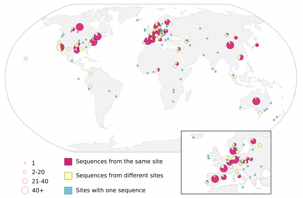
Instead of using lines, Kim suggested that we try bivariate symbols, where the number of strains is represented by the size of the circle, and the number of connections to either the same location or a different location is represented by the colour of the circle, (e.g. using a multi-hue sequential colour scheme [such as the 5-class YlOrRd on Colorbrewer]).
But then we’re back to the multitude of color problem that we avoided earlier, so that lead to the idea of the pie charts.
Our initial pie chart looked like this

But we still have a lot of choices: one sequence, 2-10, 11-20, 21-30, 31-40, and >40 connections, so we simplified it further to 1, 2-20, 21-40 and >40 (because I am not sure you can tell the difference between 5 and 15 in the original figure.
Because we don’t have the airline flight route lines anymore, we can also get rid of the mauve (blue?) background and revert to a simple white and light grey background. We don’t need to make the lines pop, because there are no lines!
And so we end with the final figure, that demonstrates the prevalence of crAssphage around the world!

A few months after we published our global analysis of crAssphage, another virus took over the world. Among all the terrific reporting about the virus and how it spreads, this work by Carl Zimmer in the New York Times is one of my favorites, in part because of the fantastic explanation of synonymous and non-synonymous mutations.
But also because of this map, and how beautifully it displays the global spread of coronavirus.

Looks familiar! I wonder if it was this much work!